
I didn't really expect them to get much traffic because I use PSP, which is not as popular as Photoshop or GIMP, and I've been writing about texture effects you can make without a camera or stock photos.
I mostly learned to make these because I could never really find the "perfect" one I wanted, and I (sadly) don't own a good camera for photography. So now I have been thinking about some other tricks I use.
This idea is a simple use of the "Add Noise" feature and various types of blur that are present in PSP.
It will help to know a little about blend modes, but if you don't, it's okay; the tutorial will cover what you need to understand.
The tutorial looks long because I have broken the steps down with explanation for beginners, but once you understand what it is I'm showing you, the basic effect only takes about a minute to produce, and the twirly colors don't take that much longer.
I think the results are quite pretty if you're looking for a background for a fantasy design or something kind of girly. :)
Visit this post for a zip download of the four finished textures.
Please note: The zip only contains the finished textures. It does not contain PSP layer files or PSD files.

Program: Paint Shop Pro 8
Difficulty: Beginner
Translatable: Partially (uses radial blur, but it's possible to skip that step or use another effect)
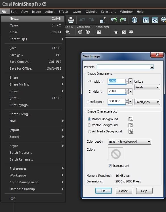
1. Create a new document
Go to File>New. Use a transparent, raster background. Mine is 2000x2000 pixels at a resolution of 300 pixels per inch. Yours can be bigger or smaller. I choose the size because it's small enough to be workable for a tutorial and big enough to be useful.
2. Create a new layer and flood fill it with black.
- Go to Layer>New Layer or click the "New Layer" button in your layer palette.
- Open the materials palette if you haven't already.
The materials palette is located by default at the top right corner of your workspace. If it isn't open, press F6 on your keyboard Or go to View>Palettes>Materials.
You'll see the word "materials" and some squares with different colors. Clicking on those squares will allow you to change the colors and alter various properties.
In the box that pops up, Choose black (#000000) and click "okay." - Choose your paint bucket tool (on the left side of your screen.) With the paint bucket selected, click on your canvas to fill with the color you selected.
I chose black because the color won't show up when I use it as an overlay later on. You can try this with other colors if you want different effects. Don't be afraid to experiment. - Name the new layer "Noise" or something else that you will recognize.
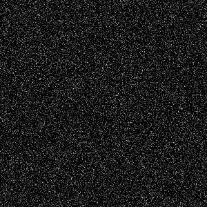
- Go to Adjust>Add/Remove Noise>Add Noise
My settings are included in the screencap example, but the only part that you have to stick with is using "monochrome." You want that setting so that the noise is white. Colored noise may interfere with your texture colors later.
Experiment to find a look that you like.
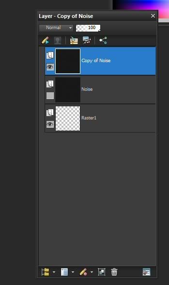
- Go to Layers> Duplicate or right click on the layer in your layers palette and choose "Duplicate." Both methods are in the screencap example.
My layer palette is in a custom location. By default, it's docked on the right side of the screen under your materials palette. - You turn off the visibility of a layer by clicking the small icon that looks like an eye next to its name.
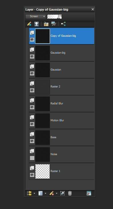
Your layer palette should now look like this.
The reason we're duplicating the layer and turning off the original is so that you'll have the original easily accessible if you decide you want to change the steps around or you make a mistake and want to go back.
- Left click on the words "Copy of Noise" in your Layers Palette. You can now change the layer name to whatever you want.
- This step is optional, but we are going to be making several more copies of the layer, and naming them helps me keep track of which one is which.
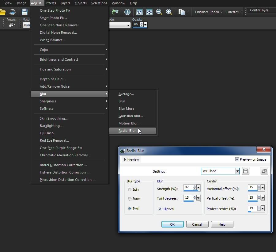
6. Duplicate "Base" twice more and rename the copies.
- Call one of them "Motion Blur" and the other one "Radial Blur"
Again, renaming is optional.
7. Apply blurs to the copied layers.
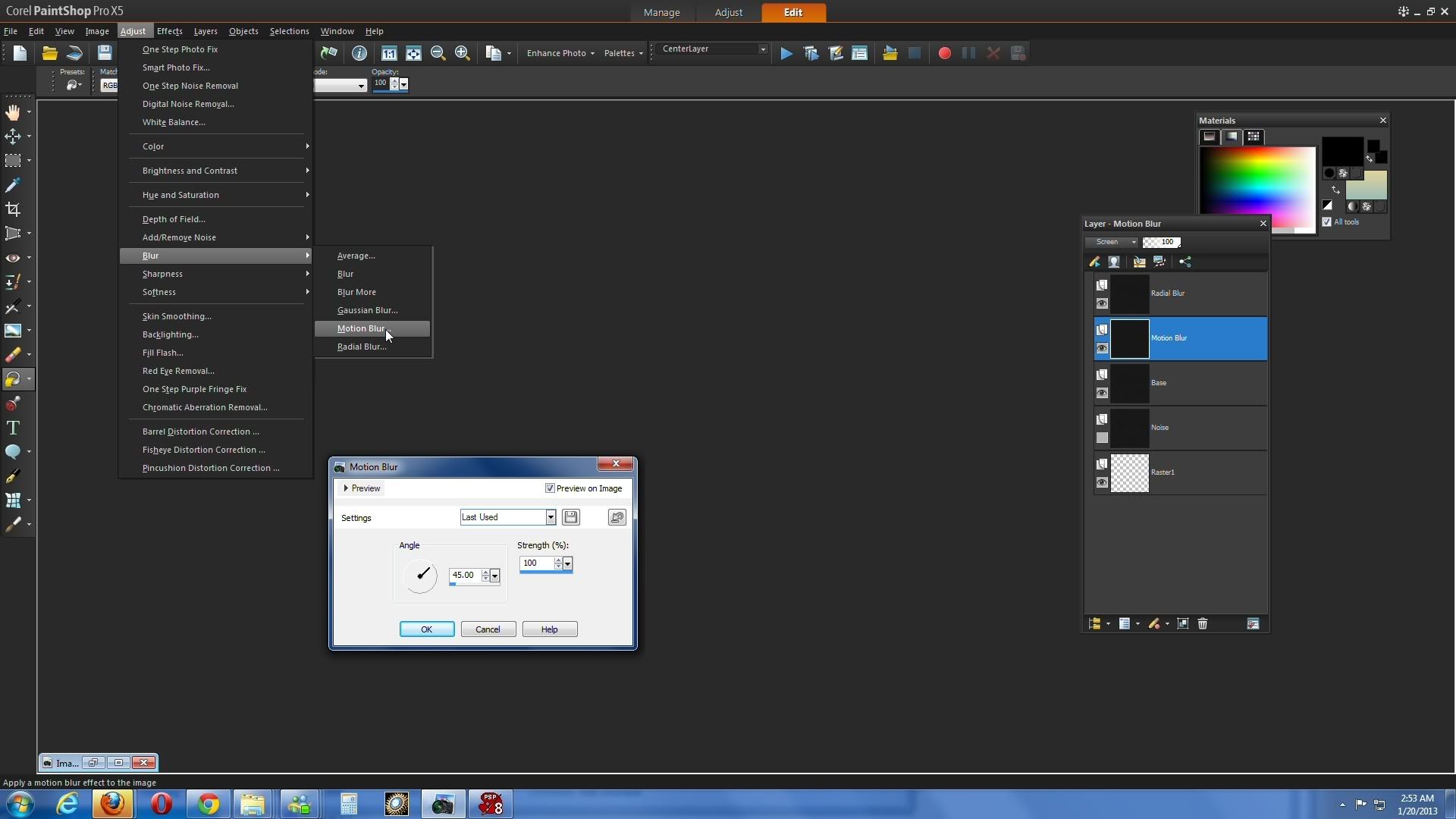
- Click on the "Motion Blur" layer in your layer palette and go to Adjust>Blur>Motion Blur
- Click on the "Radial Blur" layer in your layer palette and go to Adjust>Blur>Radial Blur
My settings are included in the screencaps above, but they are only a guide so I'm not listing them in the text. Experiment to find settings you like or with applying other effects.
Radial blur gives various kinds of effects that start in the center of the layer or selected area and move outward from there (radiate).
Motion blur attempts to simulate movement and gives a streaky effect at different angles and strengths.
Note: I haven't tried it, but for users with older versions of PSP that don't have a radial blur, try adding a layer with some brush strokes instead of noise, then use Effects>Distortion>Ripple or Effects>Distortion>Wave. It won't look like a radial blur layer, but if you follow the rest of the tutorial, it should give you an approximation of the faint waves in the finished texture.
8. Change the blend mode of both layers to "screen."
- Highlight the layer in your layers palette, then find the word "Normal" and click on it. It's in different locations depending on which version you have. A drop down menu will appear. Choose "Screen" from the list of options.
Blend modes are a set of controls that affect the way each layer interacts with the other ones. Screen mode makes the layer semi-transparent, so that the pixels on the layer below it will show through.
For this texture, it lightens the overall image and it gives the image a less uniform look. You can see bits of swirl from the radial layer, streaks from the motion layer, and the noise on the bottom looks a little less like noise because it isn't the only thing visible.
9. Turn off the motion blur layer. (See Step 4 for instructions.)
- We're going to create a merged copy of the other layers. I didn't want that one merged because I was afraid that motion effect would be too strong and dominate the texture.
10. Create a merged copy and set the new layer to "screen."
- Go to Edit>Copy>Copy Special>Copy Merged
- Go to Edit>Paste as a New Layer
- If the new layer isn't at the top of your layer palette, click on it and drag it up to the top.
- Set the copy to screen again. As you can see, each time you set a layer to screen, the image gets lighter and we have more variety of texture.
11. Turn the motion blur layer back on.
12. Duplicate the base twice more and re-name the copies.
Name one of them "Gaussian"
Name the other one "Gaussian-Resize" or just "Resize"
13. Drag both copies to the top of your layer palette.
14. Set the copies to screen.
15. Apply Gaussian Blur to both copies.
A gaussian blur is a kind of smoothing that uses a specific mathematical function. The gaussian blur window in PSP allows you to choose a radius that effects how much smoothing is applied to the image. The bigger the radius, the smoother the image becomes and the less detail there is.
A gaussian blur is a kind of smoothing that uses a specific mathematical function. The gaussian blur window in PSP allows you to choose a radius that effects how much smoothing is applied to the image. The bigger the radius, the smoother the image becomes and the less detail there is.
Setting a gaussian blurred layer to "screen" also adds a slight glow effect to the image.
- Highlight the "Gaussian" layer in your layers palette and go to Adjust>Blur>Gaussian Blur.
I chose a radius of 2; I wanted enough detail to be left that the layer had some texture but didn't have a grainy appearance.
If you use a high radius on a noise layer like this, what you'll end up with is some gray fog.
- Highlight the "Resize" layer and apply a gaussian blur again.
I used a radius of 1 this time; I wanted a little more detail left in this layer than the other one.
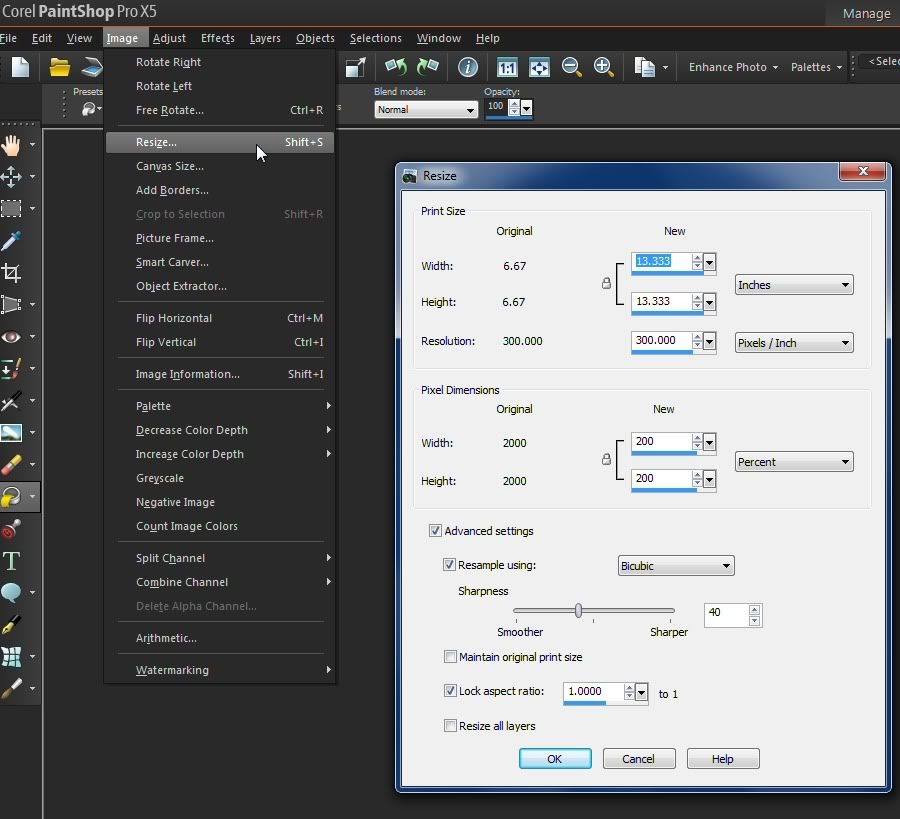
16. Resize
With the "resize" layer selected, go to Image>Resize and resize by 200%.
Normally, I wouldn't advise trying to make something that much larger in PSP. The quality of the image is drastically reduced. In this case, since all we're after is some grainy texture, it will work out. The blurred noise on that layer is bigger and adds more variety to the specks on the image.
Normally, I wouldn't advise trying to make something that much larger in PSP. The quality of the image is drastically reduced. In this case, since all we're after is some grainy texture, it will work out. The blurred noise on that layer is bigger and adds more variety to the specks on the image.
This is just to add a little more variation to the speckle pattern. If you're satisfied with what you have, you can skip it.
Lower the opacity of the copy slightly by moving the slider that says "100" in your layer palette. This is to make the image a little darker.
Your layer palette should now look like this.
18. Add Color
- Create a new layer
- Go into your materials palette and choose "gradients"
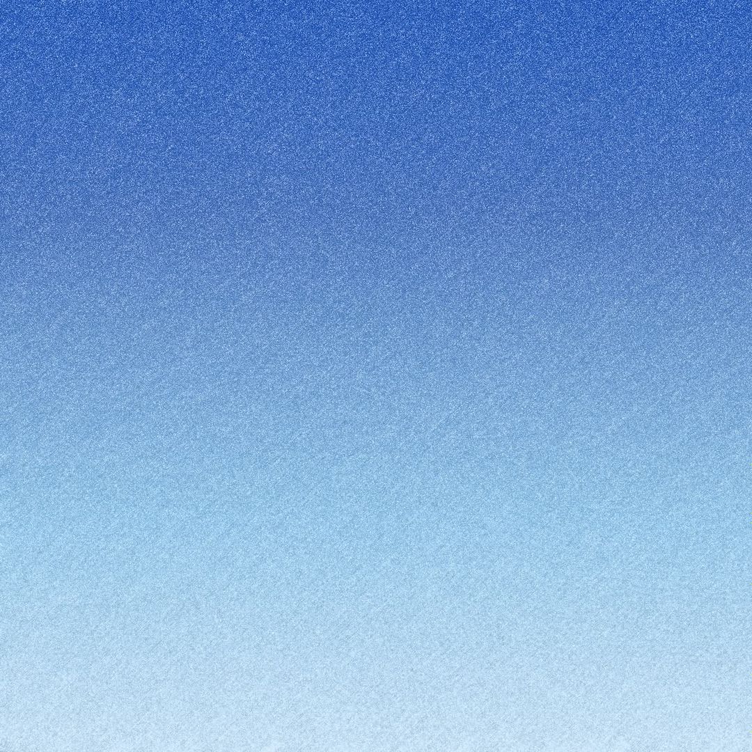
- I chose one of the default "sky" gradients because I was looking for a cool, clean look and because it would be available to anyone reading this tutorial
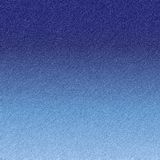
I experimented with different blend modes and settings, and eventually left the gradient at 100 % opacity on "overlay." to get this result:
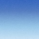
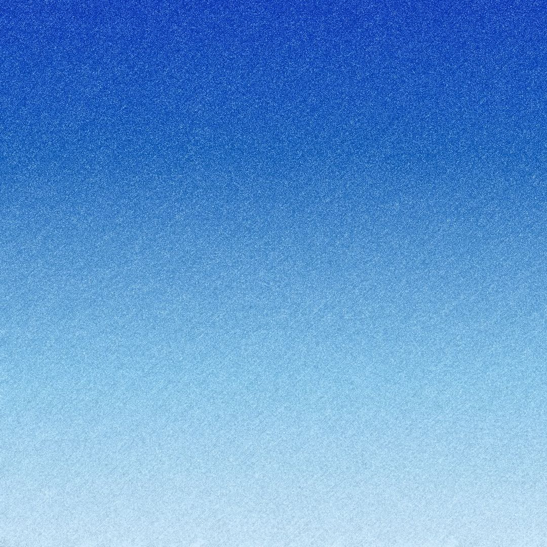
It wasn't quite bright enough for me, so I made a new layer, added the "duo-tone light blue" gradient" and again, just experimented with blend modes until I found this result at 59% opacity on "hard light:"
To add a little more contrast to version 3, I duplicated the hard light layer and changed the blend mode to "burn."
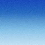
Burn is a good mode for this, but you often need to lower the opacity because if you leave it too high you'll get a result that is way too high contrast.
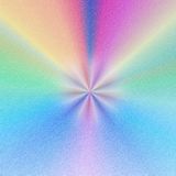
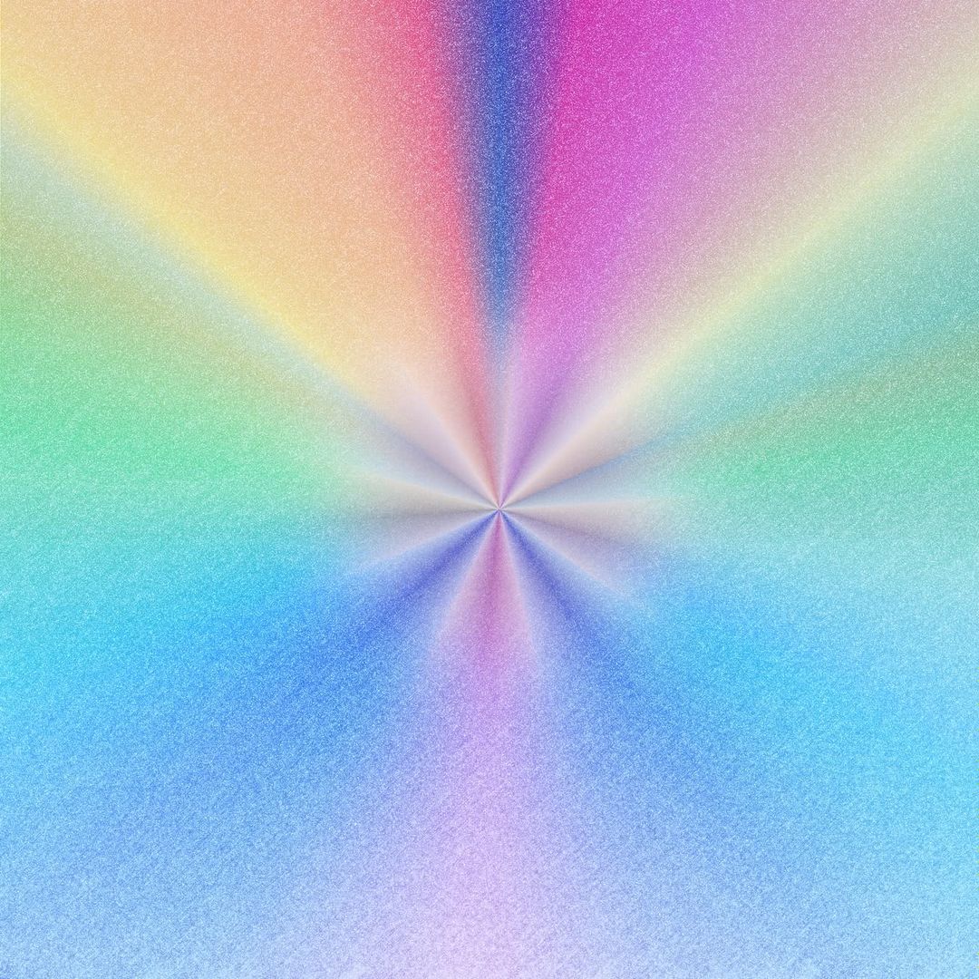
For the final result:
- Make a new layer on top of the gradients we have already added.
- Choose a more colorful gradient.
I used the "rainbow" one that comes with PSP.
- Choose Radial (the small button in your gradients window with a line extending from the middle to get the kind of pattern in the image and change the number of repeats to 1 or 2.
- Leave the center point roughly in the middle.
- Flood fill the layer and set to screen. This will allow some of the color from the gradient to show through but not dominate the textured background.
- Add another layer with the same gradient but alter the angle and add more repeats. There's no set formula; just look for something that you find attractive.
- Choose a different gradient that compliments your image but isn't too bold.
I used the "Landscape Night" one that comes with PSP.
Leave the angle the same as your previous setting so that it blends in, but add more repeats again. I have 8 repeats.
- Create a new layer.
- Use a soft round brush to stamp the center of your canvas.
- Change the blend modes until you find something you like. Mine is set to hard light at 100%
- I wanted more detail so I duplicated the layer and set it to normal, then lowered the opacity to around 40% for:

I kept all four results because I think they all might be useful. # 3 is my favorite
Hi, I started using Paint Shop Pro 8 like 2 months ago, and I'm still getting used to it. But I didn't manage to find the radial blur effect yet, and I've been trying out a few tutorials I find in internet that uses this effect. Is there a compatible plugin fof PSP 8 I can use to reach the same radial blur result?
ReplyDeleteHi, sorry, I don't know of a plugin to achieve a radial blur effect in PSP 8. Later versions of the program (v. 9 forward) do have a radial blur setting. You might try using GIMP if the radial blur effect is important to you. You can also try using the twirl effect in PSP 8 and then a high setting gaussian blur for a similar result.
ReplyDelete