
I like to work on a background texture on a separate canvas. I find it easier that way so I don't get confused about placement, and it's easier to save the texture by itself if I want to. You can just create your background on a new layer. If you don't want to put your texture on a new canvas, then just skip to step 4.
1. Choose your selection tool with these settings:
Selection type: Rectangle
Mode: Add
Feather: 0
Anti-alias:Checked
Create selection from: Current selection.
Here is a screenshot
Mode: Add
Feather: 0
Anti-alias:Checked
Create selection from: Current selection.
Here is a screenshot
Make a selection in the bottom half of your canvas, inside your guides.
2. Go to Edit>Copy, then Edit>paste as new image
3. You now have a new canvas measuring 2362x1576 pixels. This will be your texture base. Close your card template but don't deselect.
*Note: When I opened up my template, I realized that my right guide was slightly off (That's what I get for trying to write a tutorial in the middle of the night!), so my image dimensions below are going to be a little different. I didn't want to re-do the whole graphic, so since I don't plan on using this card commercially, I just adjusted the guides and moved the front image a little to compensate. It will still be fine for home printing. I wish I could say I'd done it on purpose to illustrate the effectiveness of having a "safe zone" around the edge, but nope.
*Note: When I opened up my template, I realized that my right guide was slightly off (That's what I get for trying to write a tutorial in the middle of the night!), so my image dimensions below are going to be a little different. I didn't want to re-do the whole graphic, so since I don't plan on using this card commercially, I just adjusted the guides and moved the front image a little to compensate. It will still be fine for home printing. I wish I could say I'd done it on purpose to illustrate the effectiveness of having a "safe zone" around the edge, but nope.
4. Create a new layer and flood fill with a light beige or gray color.
Mine is:
#e0e0e0
#e0e0e0
5. Duplicate this layer a few times and move the duplicates around the canvas. Change the blending modes and opacity of the duplicates and keep moving things around until you get something you like. I usually use multiply, soft light, or overlay at varied opacities.
Here's what I have.
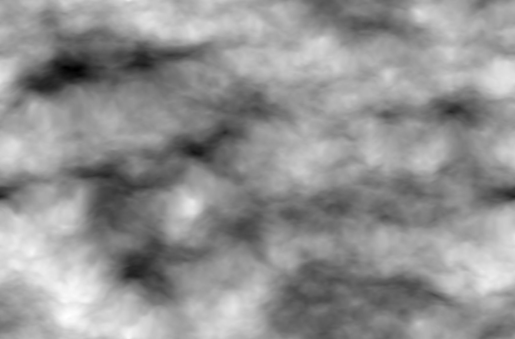
6. Draw some shapes. You can use the pen tool or preset shapes for this, depending on what you want. I wasn't sure what I was looking for as a base, so I just started adding and deleting shapes until I had something I thought was useful. I saved some of the variations so you can see:


Put each shape on a new layer and move them around the canvas/resize/rotate them until you get something you like.
*Note, you can also do this with the selection tool and a color fill, or with brushes. Using vector shapes will make it easier because you can move, rotate, and resize them easily without having them become blurry. I set these to soft light and played with the opacity until I was happy.
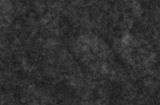
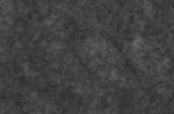
7. Add some clouds. Paint Shop Pro doesn't have a quick way to render them like Photoshop and GIMP do, but I made a post about some workarounds here if you want to learn how. It was too long to include in this tutorial. For your convenience, I'm including some pre-made cloud renders I made. Feel free to use them if you don't want to read through the cloud post.
With Mura's Meister Cloud Plug-In

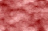
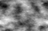
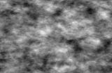
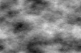

Blurred up Noise (May not look so good but will do the job.)
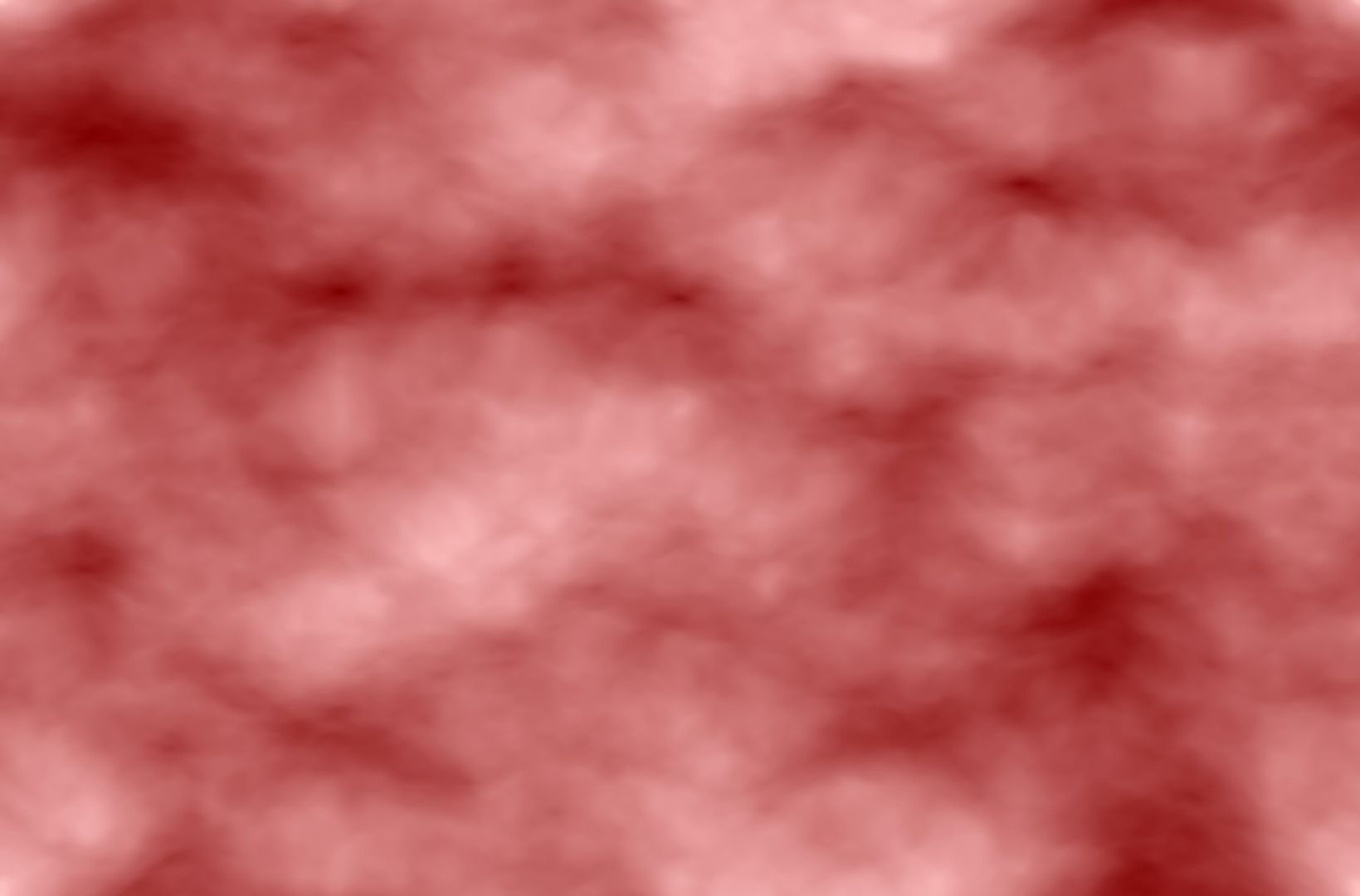
8. Find some colors you like and set your foreground and background colors. Then click on your materials palette again and go to the gradients tab. From the drop down menu, choose "foreground-background." This will create a gradient out of the colors you've selected. Try different things. Select some of your shapes and flood fill them. Use the paint brush or airbrush tool and just add color wherever you like. Set the color layers to different blend modes and change the opacity. Below is the basic progression of my coloring.


The colors I used were:
#f6898f
#f5c78c
#7dbcf2
The warm colors were a gradient I airbrushed with and set to "color", then duplicated on "overlay" at a low opacity.
The blue was a solid fill that I placed on a couple of layers in different blend modes between the airbrushed layers.
Originally, I was looking for something more traditionally "Valentine's Day" in coloring, so I went with the warm colors. I wasn't satisfied so after I clicked through several more colors and attempts at layering, I tried the blue and got something I liked. As you make textures (or graphics) and use blending modes more, you'll find that you have an easier time achieving the results that you want, but experimenting is still a huge part of any design.
9. Use your magic wand or lasso tools to select different parts of the image. Create new layers for each piece and flood fill with the new layers with some of the patterns you made from Part 2. By moving the pattern layers around in your layer palette and trying different effects and blend modes on them, you can achieve a variety of effects. Here's what I did just by placing pattern layers between the color fill and painted layers and altering the opacity.

10. Select some of your shapes, either with the magic wand tool or by going to Selections>Select All, then Selections>Float.
*The "float" feature will select the outline of any data you have on a layer. It's a quicker option than the magic wand or the lasso if you have a lot of things on one layer, or you want to select something complicated (like text). Remember to go to Selections>Defloat right away. The outline will stay selected. If you forget to defloat, though, you'll end up with an extra layer that has a new copy of the selection on it.
11. Create new layers and add some effects. I won't be providing screenshots and settings for this part since they might not apply to your image.
For the bottom corner I just used a drop shadow. (Effects>3D Effects>Drop Shadow.)
For the circle, I went to Selections>Modify>Select Selection Borders.
Then Selections>Modify>Feather
Flood fill with a darker color and play with the blend mode and opacity.
12. Embellishments and brushes.
Everything else I did (Including the text) was created with custom brushes. I used these from Obsidiandawn.com and these by LadyVictoire @ DeviantArt. (Offsite links)
For the text effect, stamp your brush once in white or another very light color.
Duplicate the layer and go to Image>Negative Image in PSP X5 or Adjust>Negative Image in PSP 8.
Move the darker layer down so the white layer is on top of it, then use your move tool to nudge the top layer over.
Remember to keep each brush or other embellishment on its own layer. That way you can add effects to them, move them around, or make other changes easily.

13. If you created your image on a new canvas, go to
Edit>Copy Special>Copy Merged in PSP X5
Edit>Copy Merged in PSP 8.
Then open your template and create a new layer.
You should still have the bottom portion of your template selected.
Go to Edit>Paste>Paste Into Selection.
6. Draw some shapes. You can use the pen tool or preset shapes for this, depending on what you want. I wasn't sure what I was looking for as a base, so I just started adding and deleting shapes until I had something I thought was useful. I saved some of the variations so you can see:


Put each shape on a new layer and move them around the canvas/resize/rotate them until you get something you like.
*Note, you can also do this with the selection tool and a color fill, or with brushes. Using vector shapes will make it easier because you can move, rotate, and resize them easily without having them become blurry. I set these to soft light and played with the opacity until I was happy.
7. Add some clouds. Paint Shop Pro doesn't have a quick way to render them like Photoshop and GIMP do, but I made a post about some workarounds here if you want to learn how. It was too long to include in this tutorial. For your convenience, I'm including some pre-made cloud renders I made. Feel free to use them if you don't want to read through the cloud post.


8. Find some colors you like and set your foreground and background colors. Then click on your materials palette again and go to the gradients tab. From the drop down menu, choose "foreground-background." This will create a gradient out of the colors you've selected. Try different things. Select some of your shapes and flood fill them. Use the paint brush or airbrush tool and just add color wherever you like. Set the color layers to different blend modes and change the opacity. Below is the basic progression of my coloring.


#f6898f
#f5c78c
#7dbcf2
The warm colors were a gradient I airbrushed with and set to "color", then duplicated on "overlay" at a low opacity.
The blue was a solid fill that I placed on a couple of layers in different blend modes between the airbrushed layers.
Originally, I was looking for something more traditionally "Valentine's Day" in coloring, so I went with the warm colors. I wasn't satisfied so after I clicked through several more colors and attempts at layering, I tried the blue and got something I liked. As you make textures (or graphics) and use blending modes more, you'll find that you have an easier time achieving the results that you want, but experimenting is still a huge part of any design.
9. Use your magic wand or lasso tools to select different parts of the image. Create new layers for each piece and flood fill with the new layers with some of the patterns you made from Part 2. By moving the pattern layers around in your layer palette and trying different effects and blend modes on them, you can achieve a variety of effects. Here's what I did just by placing pattern layers between the color fill and painted layers and altering the opacity.

10. Select some of your shapes, either with the magic wand tool or by going to Selections>Select All, then Selections>Float.
*The "float" feature will select the outline of any data you have on a layer. It's a quicker option than the magic wand or the lasso if you have a lot of things on one layer, or you want to select something complicated (like text). Remember to go to Selections>Defloat right away. The outline will stay selected. If you forget to defloat, though, you'll end up with an extra layer that has a new copy of the selection on it.
11. Create new layers and add some effects. I won't be providing screenshots and settings for this part since they might not apply to your image.
For the bottom corner I just used a drop shadow. (Effects>3D Effects>Drop Shadow.)
For the circle, I went to Selections>Modify>Select Selection Borders.
Then Selections>Modify>Feather
Flood fill with a darker color and play with the blend mode and opacity.
12. Embellishments and brushes.
Everything else I did (Including the text) was created with custom brushes. I used these from Obsidiandawn.com and these by LadyVictoire @ DeviantArt. (Offsite links)
For the text effect, stamp your brush once in white or another very light color.
Duplicate the layer and go to Image>Negative Image in PSP X5 or Adjust>Negative Image in PSP 8.
Move the darker layer down so the white layer is on top of it, then use your move tool to nudge the top layer over.
Remember to keep each brush or other embellishment on its own layer. That way you can add effects to them, move them around, or make other changes easily.

13. If you created your image on a new canvas, go to
Edit>Copy Special>Copy Merged in PSP X5
Edit>Copy Merged in PSP 8.
Then open your template and create a new layer.
You should still have the bottom portion of your template selected.
Go to Edit>Paste>Paste Into Selection.
And you're done, on to part 4.
No comments:
Post a Comment