
Program: Paint Shop Pro (Should work for most versions.)
Difficulty: Beginner
Translatable: Sorry, not this time!
The gradient tools in Paint Shop Pro are set up a lot differently from the ones in the other programs I've seen. They can seem a little daunting at first, but once you get used to them, it's pretty simple. I'm going to show you step by step how to make and save custom gradients.
I have 2 versions of PSP on my computer. PSP 8 was made by JASC Software. The latest version, PSP X5 was made by Corel (which bought out JASC several years ago.).
For compatibility purposes, I try to make my gradients in the older version. I'm doing most of the work in PSP 8, but I include screenshots and directions for both programs. The gradient editor hasn't really changed from one version to the other. So, no matter which version you have, you should be able to follow along.
Click here for a set of gradients I made using the images in this tutorial. It contains all of the ones in the examples and a bunch more.
Notices: Images used in this tutorial are public domain. Links to the originals are provided in the text.
Tutorial content is (c) Rose B. Fischer and Encompass Rose Design. It may not be reprinted without express permission.
Before You Start the Gradient Editor
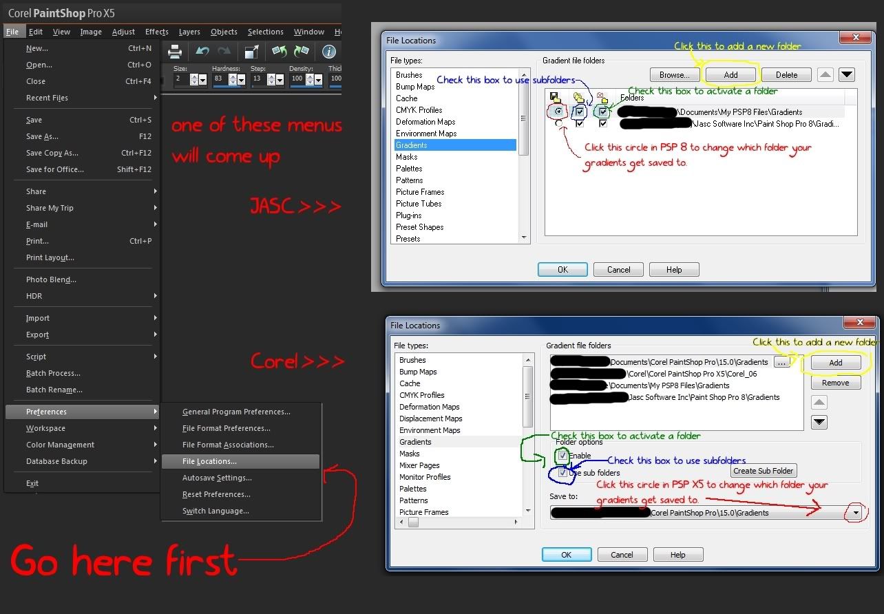
1. Set Up Your Save Location. (Optional, but good to know about if you plan to share your creations online.)
Since I make gradients to share online, I create a new subfolder for each set. You don't need to if you will only be making a gradient here or there, but it's good if you plan to make a lot of them. Otherwise it will be hard to keep track of where they are.
You can find detailed instructions on how to set up a custom save location in this post. It takes about 2 minutes. See Ex-1 for a quick overview.
2. Find some colors you want to use.
There's no set way to do this. If you have a color scheme in mind or you know what kind of effect you're after, you could try just picking some colors as you go.
Usually I don't, so I look for photographs that have interesting progressions of color and something eye catching in how they're arranged.
Some places I look for pictures are:
Note that you should be careful about reading the license agreements on rgbstock and stockxchange. Since in this case you are not actually using the photograph but just choosing some colors, you should be safe in how you use your gradients, but if you are in doubt, always contact the stock provider for permission.
Photos on public domain sites like Pixabay and photos-public-domain do not have any copyright restrictions on them and can be used however you like as long as you don't try to claim ownership of the image.
I picked them because each one had a variety of color combinations that were well defined and would be easy to extract. The images were also good quality and quite crisp.
3. Open Your Images in Paint Shop Pro
Using The Gradient Editor
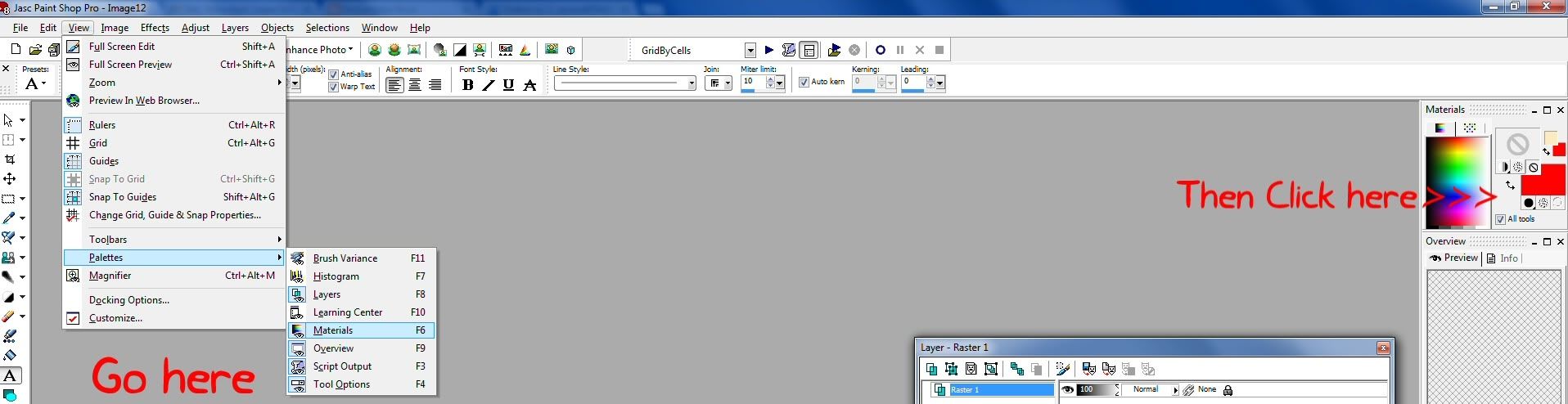
The materials palette is located by default at the top right corner of your workspace. You'll see the word "materials" and some squares with different colors. Clicking on those squares will allow you to change the colors and alter various properties.


So, I hope you've learned a few things and have a better understanding of how to use gradients in PSP. If this tutorial helps you to make some, I would love to see your creations!
3. Open Your Images in Paint Shop Pro
- Go to File>Open and navigate to the folder where you saved your images.
- You can also open the folder in Windows Explorer and click what you want into PSP. I do this quite often when I'm making resources because it's easier to browse a folder in Windows explorer than it is to wait for PSP to load the navigation windows.
Using The Gradient Editor
1. Open the materials palette if you haven't already. (See Ex-4.)
The materials palette is located by default at the top right corner of your workspace. You'll see the word "materials" and some squares with different colors. Clicking on those squares will allow you to change the colors and alter various properties.
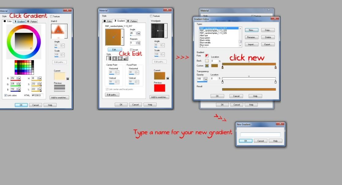
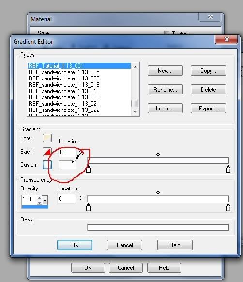
2. Open the gradient editor and click "New". (See Ex-5)
- Click on one of the large colored squares in your materials palette.
- The material properties dialog box will open. Click the "Gradients" tab.
- From the gradients tab, click "Edit."
- Click "New" to start creating a new gradient.
- If you want to edit one of the existing gradients that come with PSP, click copy in PSP 8 or save as in PSP X5 and give it a new file name. Otherwise you will accidentally overwrite the existing gradient file. I've made that mistake too.
When you name your gradients, give them a name that's meaningful. PSP will not load files with duplicate names. So, if you create a set of gradients in a subfolder and "Gradient 1," "Gradient 2," etc, then you create a second set of gradients in a different folder and call them "Gradient 1," "Gradient 2," the program thinks they're duplicates and will only load the first one it finds with each name.
This is especially relevant if you plan to share your gradients online. I tag all my files with "RBF_" and a set name. I'm also fond of subfolders and the "batch rename" feature in PSP because my filenames can get long.
3. Add Colors to your gradient
The bottom part of the editor window has three bars. The first and second ones have little icons that look like crayons at each end. Those are where you edit your gradient. The third bar shows you how the gradient will look when applied.
By default, a new gradient starts with two color point icons. You can add more points by moving your cursor along the top bar and clicking.
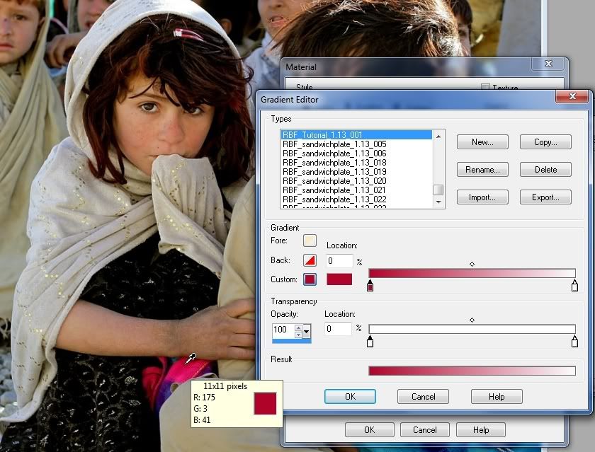
- Click on the first icon to select it. There are a couple of ways to choose a color.
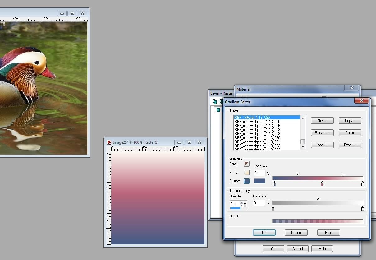
- You can click the small white rectangle next to where it says "custom." You'll know that you are in the right place because your cursor will turn into an eye dropper as you hover. Clicking will open a color selection dialog. (See Ex-6)
- Instead of using a color in the selection box, you can move your cursor out to the image you left open and use the eye dropper to pick colors from that. (See Ex-7)
- I selected a pink from the shawl in my picture. The end point of the gradient is still white, and the transition point of the gradient (where the two colors meet) is in the center, so the pink gradually fades to white.
- If you like that, you can save your gradient by clicking "okay." Duotone (two color) gradients are often useful for lighting effects and for making subtle textures--although I don't think the bright pink I'm using here is very subtle.
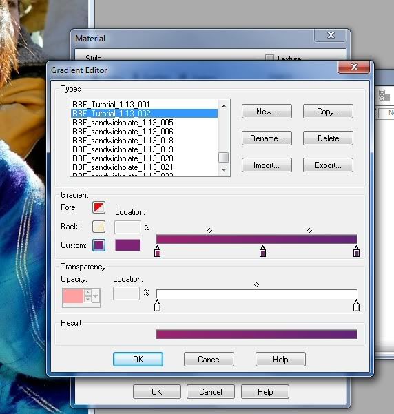
- If you want to add more colors, you can click on the end point and repeat the process of picking a color. I started by adding some of the shawl's purple on the end point. (See Ex-8)
- To add more colors, click at any point on the top bar where you want a new color to start. I'll place another point in the center. (See Ex-9)
New points will start out with whatever color is on the bar where you click. You can alter them the same way we did above.
White or a lighter color in the center will give you effects like these:


Black or a darker color will give you effects like these:


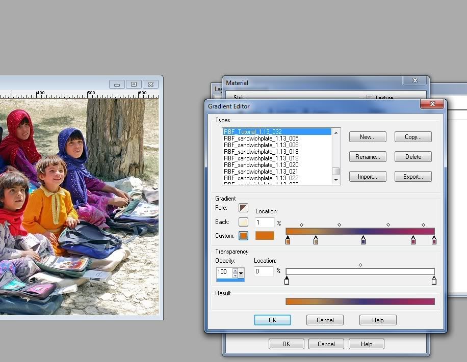
You can add as many color transitions as you want. Experiment with placing them at different intervals to create various effects. Here I tried to follow the color pattern on the shawl in different areas:


Try picking some other colors from different areas of your image. You won't like everything you get, but experimenting is part of the fun of the creation process.
In this example, I chose my center color first and built the gradient outward by picking colors around it.
4. Alter the transparency of a gradient
- The second bar (underneath the color editor) is the transparency editor.
- You can add transparency points and alter their starting points the same way you can add colors and alter the points of transition. To make something fade out, you lower the opacity on the transparency point. To make it fade in, you bring the opacity back up.
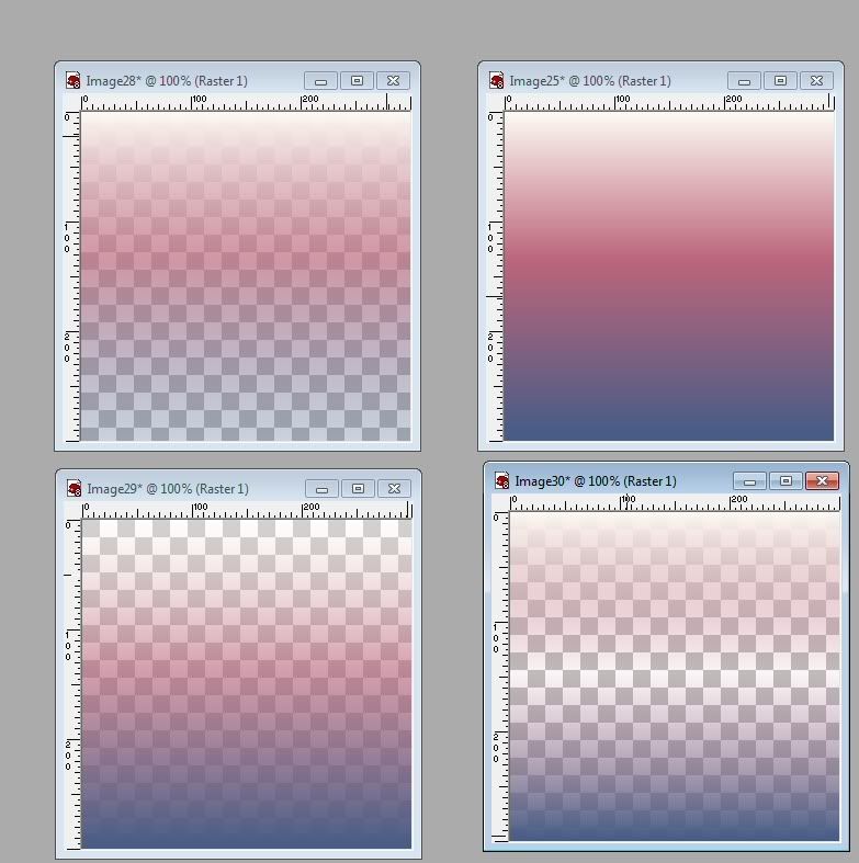
- In this example, I created a base gradient from the colors on the mandarin duck's head.
- I used the base gradient to create three others with different effects by putting trnnsparency points at different locations. (See Ex-11c)
Tips On Using Gradients
- Changing the style of a gradient when you apply it can give you drastically different results.
The style buttons are located in the material properties box (the first window that opens when you click your materials palette in step 2). They are the little icons right underneath the edit button. You'll see the word style.
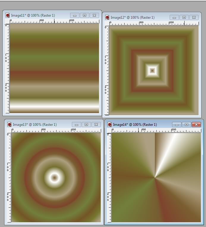
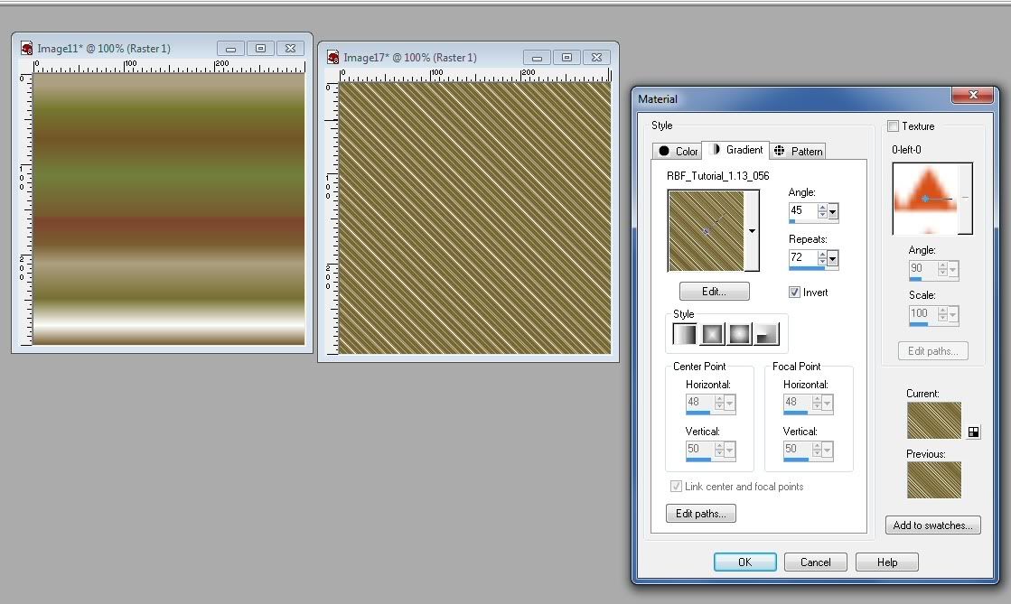
By default, PSP displays linear style gradients. Click through the buttons and see what kind of results you get. For example, I made this gradient from the reflections in the water surrounding the mandarin duck. Set to linear, it doesn't look very useful. Here's what happens when you change gradient styles. The last one would be particularly useful to me for lighting effects, but the others might have some fun applications as well. The radial one makes me think of Scooby Doo, even if the colors are different. - Changing the angle or adding repeats, as in this example can quickly give your project some texture. Try setting to overlay or burn on a medium to low opacity.
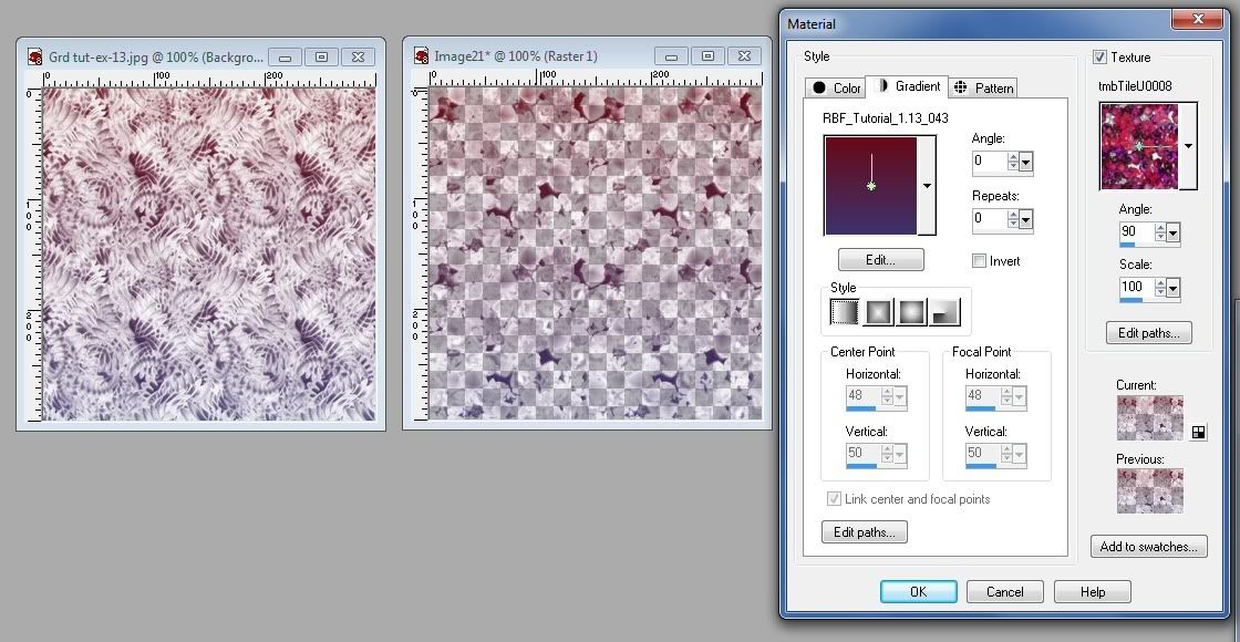
- Check the texture box (on the right side of material properties) for interesting overlay effects like this example The tiles I used in the example were from redfield.com. The gradient was at 100% opacity with the texture applied to when I used it.
- And one final tip. If you don't really want to save a special gradient but are just looking for a way to quickly turn your current foreground and background colors into a gradient, you can.
Select the foreground and background colors you want.
Open your materials property box and click the gradients tab. (Directions are in step 2 above.)
Scroll through the choices to "foreground-background." (They are saved displayed alphabetically.)
Click okay.
So, I hope you've learned a few things and have a better understanding of how to use gradients in PSP. If this tutorial helps you to make some, I would love to see your creations!
Thank you so much for this tutorial and the illustrations. I cannot wait to get started in making my own/
ReplyDelete