
Program: Paint Shop Pro X5, should work in earlier versions.
Difficulty: Intermediate. Assumes basic knowledge of program features and menu locations. (ie: I'm not going to explain where the materials palette is or how to switch to the gradients tab.)
Translateable: Theory should work in other programs. I don't know if they'll have the exact features and materials used.
I started writing up a much longer and more detailed tutorial like this back in October, but I somehow lost the reference images I made for it, so I probably won't be finishing it.
I want to start off by saying that I have a huge resource library. Some of them date back to the early 2000s and have survived 4 or 5 computers. I don't even know how that's possible since I lose things I need all the time.
I also like making resources. I think I've said before, making graphic resources is as much fun--or more--for me than making the art I use them for. So, I absolutely encourage folks to browse stock photography and free resource sites.
One thing I have noticed, though, is that a lot of people seem to ignore the resources they have built in to their imaging programs. There's a lot of material that comes with Paint Shop Pro, and there are a who bunch of effects you can use.
There's no right or wrong way to make a texture. Different methods very often produce similar results. I use stock pictures in my textures a lot. Sometimes I just find that it's easier and faster to make a custom texture for a project as I go along. This texture was done with a "quick and dirty" method to get a usable result in relatively short time. If I was adding it to a project, I'd probably alter it some more once I had it on that canvas.
Normally I would have a project about 2/3 finished and I'd have realized that the background needs something, so I would think about applying (more?) textures. Since I don't have a ready-made project here, I just made it up as I went and wrote down the steps. I had no idea what I was going to get when I started it or if it would turn out at all. The best way to learn is just to open your program and start experimenting. You'll make a lot of crap, but you might just come up with a method you like and will be able to utilize in the future.
1. Open a new image. For the purposes of the tutorial I am making my canvas
1000x1000 pixels at a resolution of 72 ppi. (Normally I would make a background larger, but I'm going to assume that most of the folks reading this are designing web graphics so that should be fine.)
2. I would pick some colors that complimented the project I'm working on and just paint randomly. Then duplicate the layer a couple of times, move the duplicates around the canvas and change the blend modes. If you get some edges you don't want, you can erase them with a soft brush or apply a blur of some kind. Most people seem to use gaussian blur; you can also use radial blur or motion blur. The idea is to keep the colors but lose the unwanted detail. I got this, which will be the base for my texture. Merge layers.
3. I want to give this texture some more depth, so my materials palette, I click the patterns tab and choose "smoke". I create a new layer and flood fill with the smoke pattern. I don't like the whiteness, so I invert the layer. (Adjust>negative image in PSP 8; Image>negative image in PSP X5)
4. Apply a gaussian blur with a radius about 6.
5. Set the layer to overlay or burn and change the opacity to your liking. Mine is on burn at about 45% See here.
6. I erased random parts of the layer until I got this.
7. I wasn't quite happy with it, so I created a new layer, chose a medium gray as my foreground color and checked the texture box with "grain fine cloudy" selected at a 45 degree angle. Flood fill, set to burn at about 55 %, and then again erase random parts. It looks like this.
8a. Now this step is tricky. I wanted a fading pattern. So I created a foreground/background gradient (see step 8 on the previous texture for directions.) I used white my background color and black as my foreground color. Create a new layer and flood fill to get this.
8b. Create a new layer and flood fill with a pattern of your choice. I just wanted some lines and boxes, so I chose plaid-red-white.
8c. I just want the pattern, not the color, so I desaturate the layer (Adjust>Hue and Saturation>Hue/Saturation/Lightness)
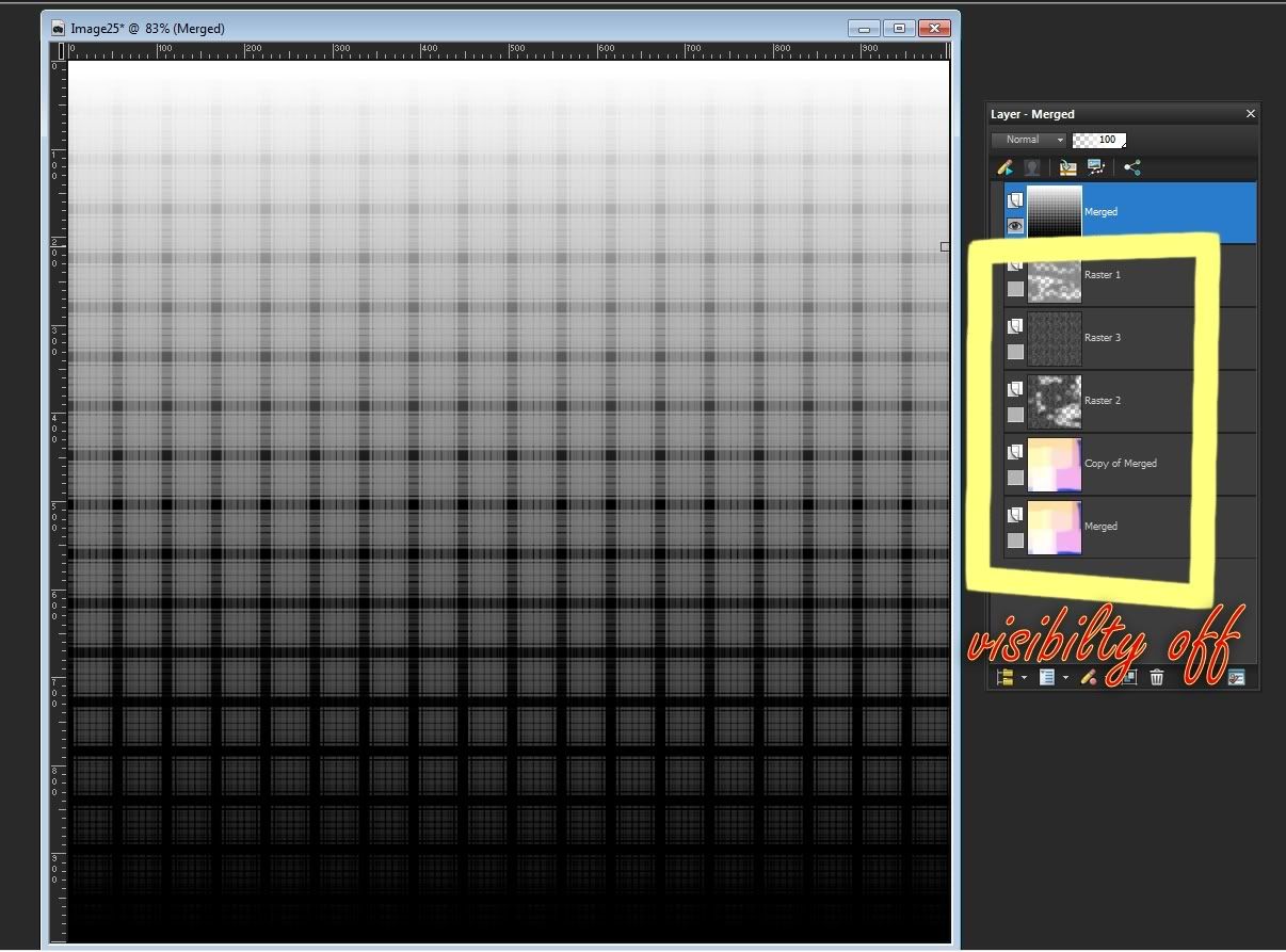
8d. I want to combine the plaid pattern layer and the gradient layer underneath it, but I don't want to merge everything else. So I turn off the visibility of all the layers underneath the two you just added. Then go to Layers>Merge>Merge visible. You should have this.
9. Turn the visibility of all layers back on (Layers>View>All).
10. I set the plaid layer to burn and lowered the opacity until I was satisfied. Mine is about 40%. See here.
11. Use the eraser brush to take out any parts of the plaid that you don't like.
Tips: You can change the shape of your eraser brush the same way you can with the paint brush. I used the "surreal" brush that comes with PSP 8 to erase edges and other parts I didn't want. This is what I have.
12. I wanted something more distressed and grungy, so I added a new layer under the plaid pattern layer and then went back to my patterns and picked cracks from the menu. (I could also go to Effects>Texture Effects>Texture and have a lot more options to play around with for adding cracks, but the basic pattern fill is enough right now.) I set the cracks layer to burn at 100 and erase anything I don't want. This is what I have.
13. I'm not satisfied with the level of grunge here, so I decide to add some noise. Duplicate the base layer, drag the duplicate up so it's on top of the cracks layer and then go to Adjust>Add/Remove noise>Add noise. I used gaussian at 50 % with monochrome checked. Then I once again used the eraser brush to take out any parts I didn't want, and I did some random stamping. This is what I got.
14. Next I added a paper pattern (paper 03). I just want the texture, not the colors, so I desaturated the layer. I set the blend mode to multiply and got this.
15. The details aren't pronounced enough to me so I went to adjust>Brightness and Contrast>Brightness/contrast and increased the contrast for this.
16. It still was't quite enough so I tried duplicating again and setting the layer to burn for this.
17. I wanted to try fading out some of the colors without losing the detail, so I duplicated again, and this time set the copy to overlay for this.
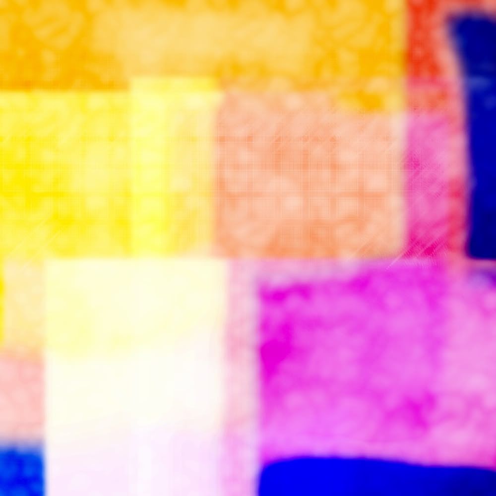
18. I like that, but now I've lost the plaid squares I spent so much time on before. So I move the plaid layer up to the top of the layer palette and increase its opacity. See here.
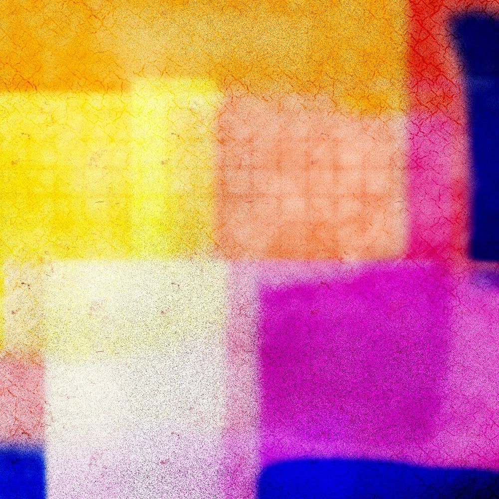
19. Even though I normally like bright, cheerful colors, this texture is just not doing it for me. Muted colors are sometimes more useful in resources, and I want the texture to be dirtier, so I add another pattern layer (cork) set it to multiply and erase bits again. Then I add a light purple gradient and set it to soft light for this.
*Note: If I'd been doing it for a project, I probably would have tried to bring it back closer to the original colors I'd chosen, but since this is a tutorial and purple is my favorite color, I took a little liberty.
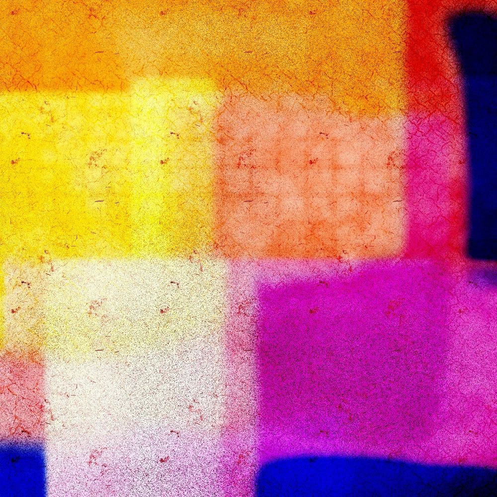
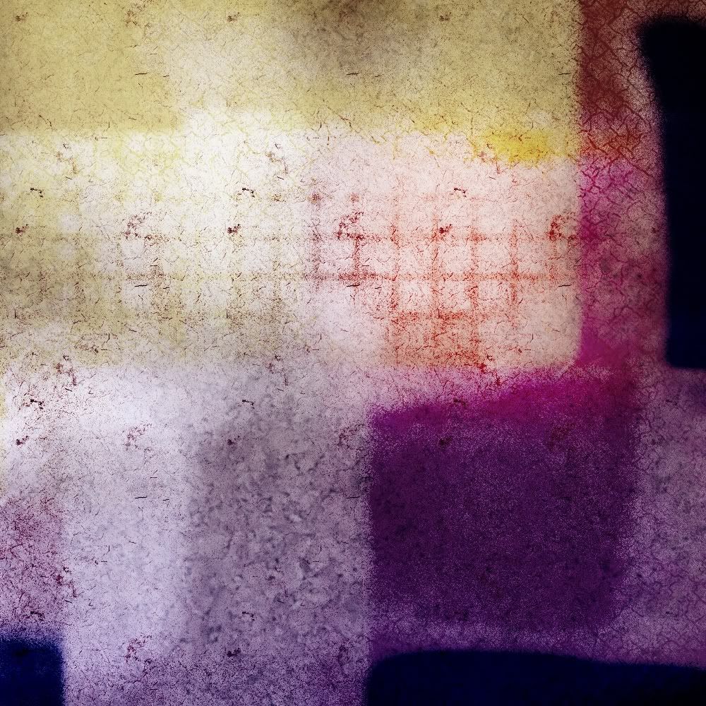
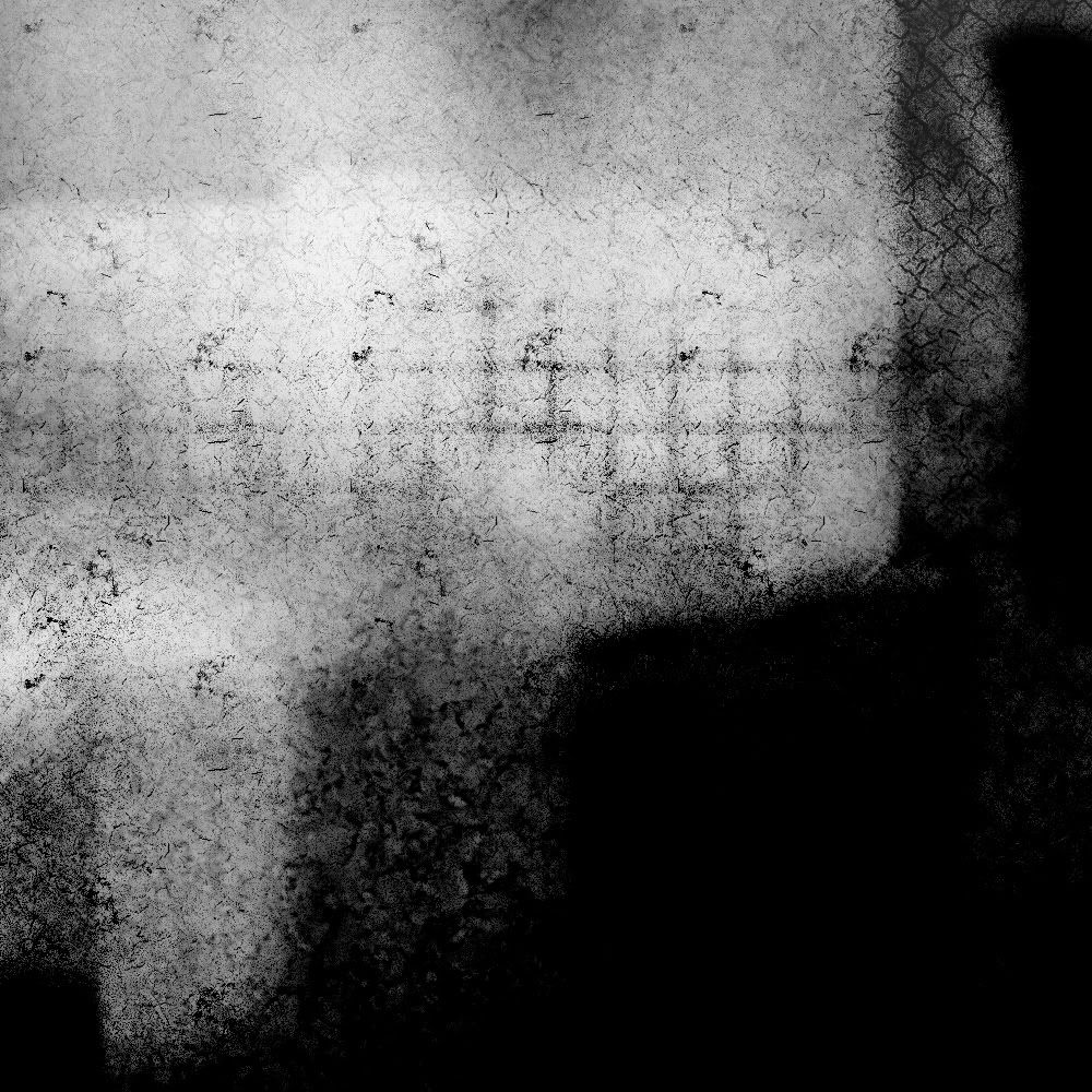
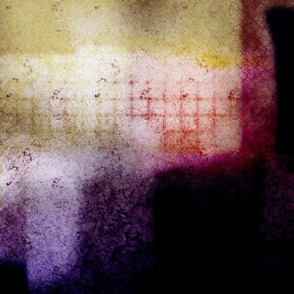
20. That's pretty good, and I was going to stop there, but I decided to make a grayscale version of the texture as well. I used my black and white gradient from earlier, and I was supposed to set the layer to color legacy, but I accidentally used burn instead. I liked the look of it, but it was way too contrast-y, so I lowered the opacity to about 55% to get the color result below. I decided to keep it, but I also wanted a grayscale version, so I duplicated the gradient layer and set the copy to color legacy.
Finished textures, plus some alternates I kept:


-You want to think more about the shape and pattern of the elements you're adding (like the basic shape I made when I was painting or the lines and boxes in the plaid pattern) than you do about what they look like. I'm not a big fan of plaids, but the plaid pattern was a quick method of getting the shapes I wanted.
-There's more than one way to achieve the same results; you don't need to follow my tutorials exactly. You might find a way that's easier or better for you. PSP has a lot of more advanced features like levels and curves that you can utilize.
-Look at the details (like the grain in the paper pattern) and find ways to enhance them. Lowering the saturation and setting the layer on overlay or soft light will usually allow the details to show up.
-As I said before, the biggest thing to do is experiment. It's easier to recognize what will work and how to achieve the results you want (or something close to them) as you practice.
Thank you for offering this freeform tutorial. Sometimes I want to do something like this, but don't really know where to start.
ReplyDelete